Mocha Mousse: Designing with Pantone Color of the Year 2025
Pantone Color of the Year 2025 Mocha Mousse is here. Knowing the color of the year is one thing, but actively incorporating this warm, luxe color into your marketing and branding can be especially impactful.
To ensure your collateral is relevant but doesn’t look too trendy, we went straight to the experts for you – the Creative team at our online division, Smartpress. They spill the tea on how to design with Mocha Mousse PANTONE 17-1230 (if you want to get technical with it) so your assets not only look of-the-moment, but also boost your biz.
See what’s so special about this shade as we:
- Reveal what color Mocha Mousse is
- Explore specific use cases
- Offer insider design tips
“With its sophisticated, earthy elegance, Mocha Mousse can stand alone or serve as a versatile foundation.”
What Color is Pantone Mocha Mousse?
Pantone describes Mocha Mousse as a soft, warming brown. Radiating a luxe indulgence blended with comfortable contentment, it’s a color that is both aspirational and accessible.
Per Pantone, “It nurtures us with its suggestion of the delectable qualities of chocolate and coffee, answering our desire for comfort. With its sophisticated, earthy elegance, [it] can stand alone or serve as a versatile foundation, enhancing a wide range of palettes and applications, from minimalist to richly detailed designs, across all color-focused industries.”
How to Use Mocha Mousse for Marketing & Branding
So how do you add this rich, elegant shade to your marketing and branding? That’s the question on every designer, business owner and nonprofit’s mind. The goal is to incorporate Mocha Mousse without going overboard. You want your assets to look like they’re part of the movement but not like they’re trying too hard.
To get you started, we’ve got four product ideas that work well with the 2025 Pantone color of the year.
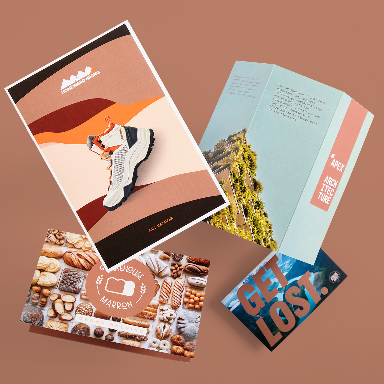
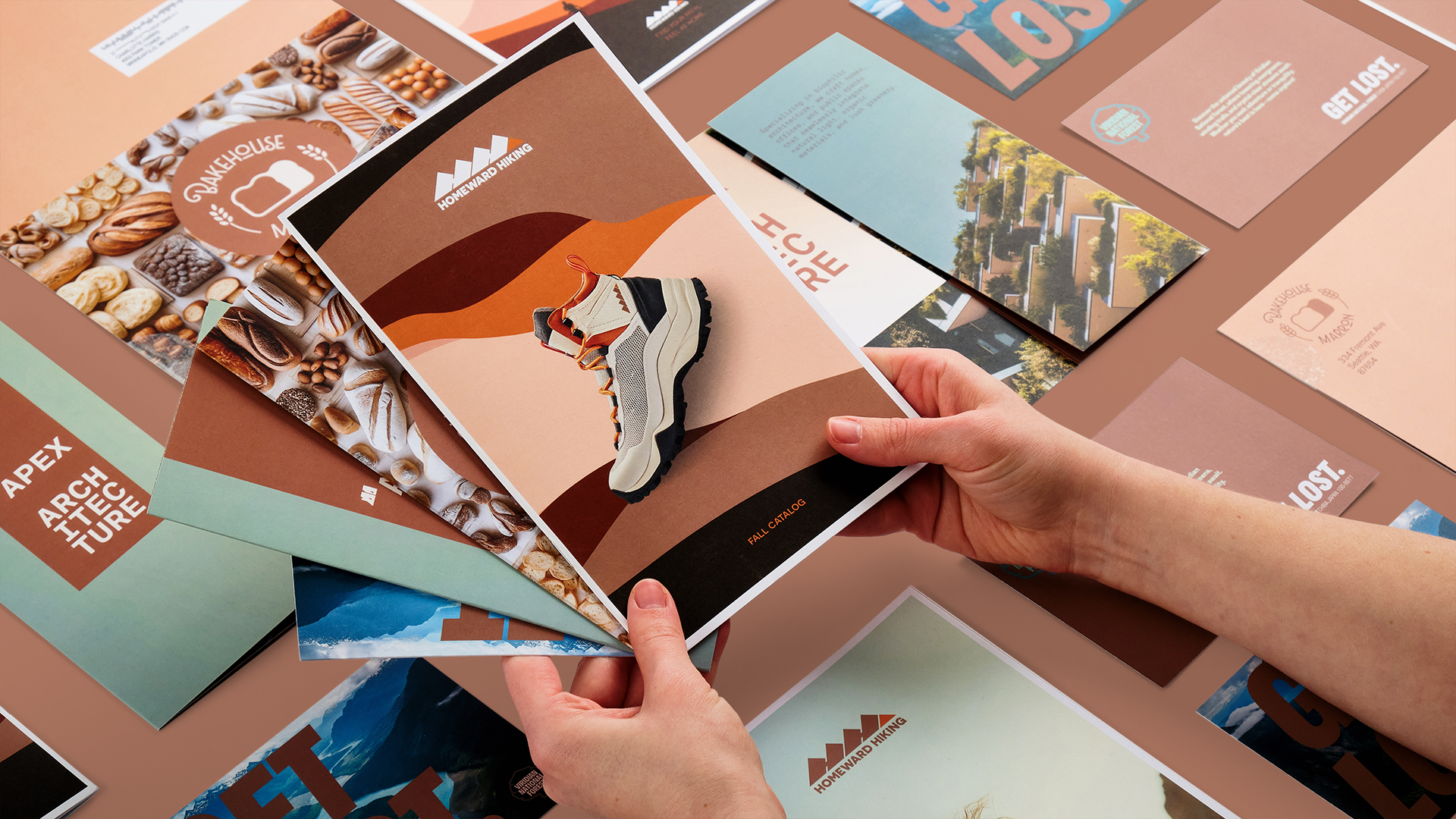
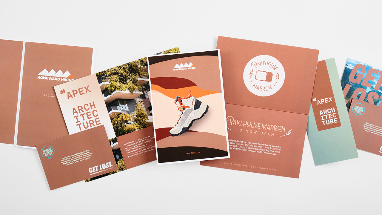
Four Products to Pair with Mocha Mousse
As a versatile neutral, Mocha Mousse suits marketing and branding for so many products and industries:
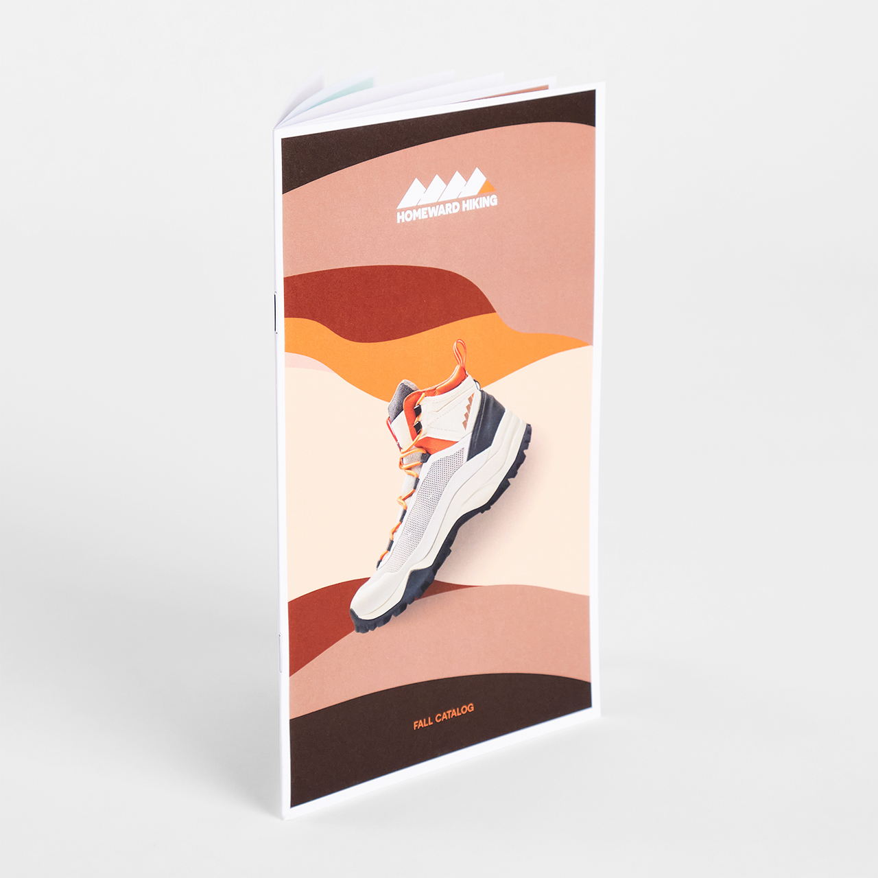
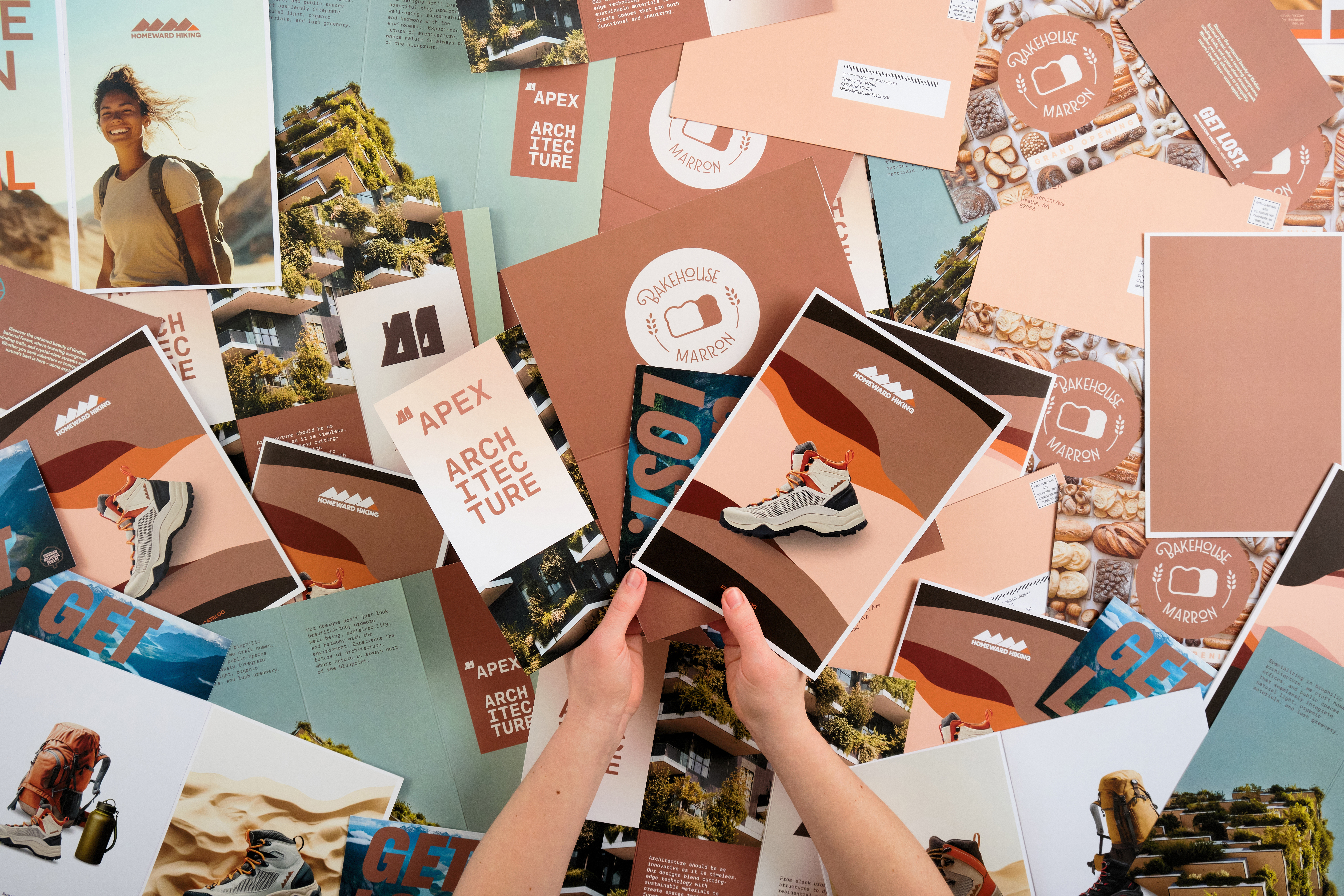
- Catalogs: Use Mocha Mousse as the page color, especially if your products have a neutral tone or you’re working with high-quality photography. Custom catalogs with Mocha Mousse are an especially great option for an outdoor gear company or cosmetic or skin care line.
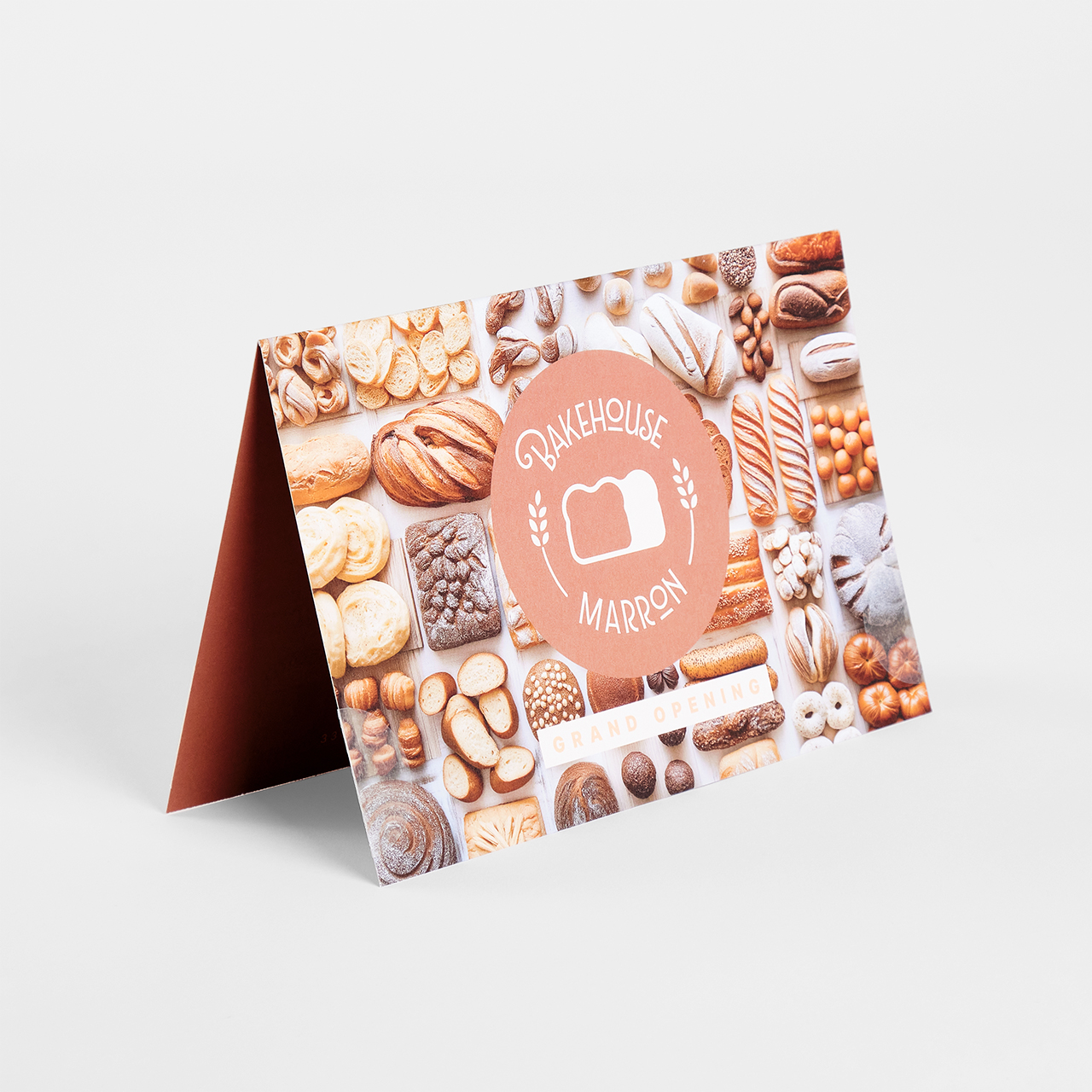
- Folded Self-Mailers: With its warm vibes, Mocha Mousse creates an inviting, indulgent feel that’s perfect for bakeries, pastry shops and cafes. This shade makes direct mail look more tempting than ever.
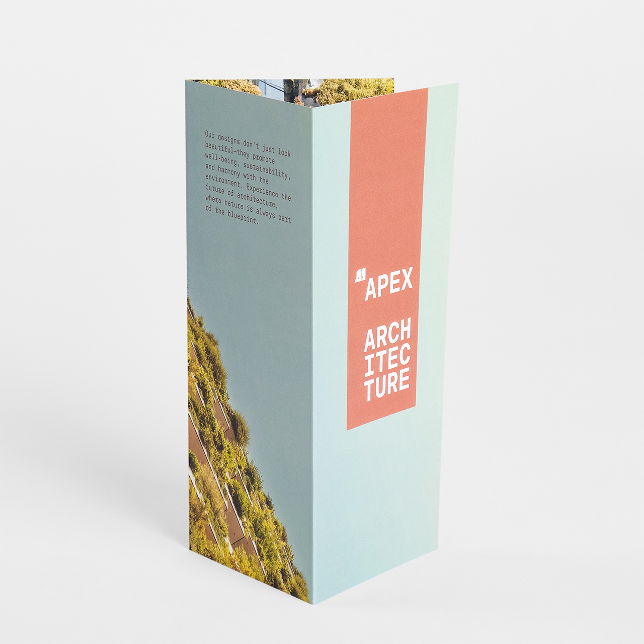
- Brochures: There’s something inherently sensory about Mocha Mousse that makes it ideal for brochures for real estate and architecture firms. Its subtlety works in perfect harmony with images of various metals, wood and glass.
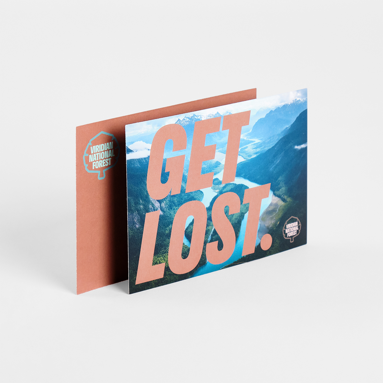
- Postcards & Raised UV Postcards: Postcards are already a great vehicle for nature photography and outdoor imagery, but when you combine it with Mocha Mousse, you send a simple yet strong message. We love postcards for national and state park promos.
How to Design with Mocha Mousse
Whether you’re a beginner graphic designer or a seasoned one, using a new color to its full potential can be challenging. For the Pantone Color of the Year 2025, Smartpress’ Creative team offered their thoughts and expertise on why it’s a great color for right now, how to best use it and what not to do with it.
Mocha Mousse Suits the Moment
To Smartpress’ Creative team, the Pantone Mocha Mousse color is refreshing, especially in a world where everything is competing for attention. It’s nice to have a color that makes an impact without insisting upon itself.
They love how this versatile neutral combats digitization and AI, too. It’s a color that feels like a return to nature, something constant and stable that’s in conversation with both the planet and people. It’s a much-needed break from the noise of today.
Mocha Mousse Dos
No matter what assets you’re designing, you’re probably wondering, “What colors go well with Mocha Mousse?” Smartpress’ Creative team recommends using Mocha Mousse as a supporting color because it complements high-color photography and brighter accent or brand colors.
They love that it doesn’t completely overtake a design and that it works with various design concepts: It can be a springboard for louder accent colors or a collaborator with muted, organic colors. One of the team’s favorite things about Mocha Mousse is that it pairs well with all kinds of skin tones, so models and portrait photography look amazing.
And finally, if you’re using it as a foundation for your projects, be generous with a full flood of color, and be sure to use big, bold type for legibility. To get the most accurate rendering of Mocha Mousse, we recommend choosing a gloss or matte coated stock.
Mocha Mousse Don’ts
While Mocha Mousse is versatile, that doesn’t mean it’s good for every design idea. Like most things, there are the dos and don’ts. For Mocha Mousse, the Creative team would steer clear of using it for marketing high-tech products and services. (Remember all that nature talk before? Yeah, stay on that path.)
The other thing to not do is use Mocha Mousse for body copy and small text. It’s a lighter tone, so your background would have to be dark enough to create contrast and your font would have to be large enough to be clear – which isn’t easy.
Before custom printing your collateral, brush up on the seven principles of design.
Print Your Marketing Collateral with The Bernard Group & Smartpress
With its warm, rich hue and soft contentment, Mocha Mousse makes a true impact on your marketing and branding. As the Pantone Color of the Year 2025, it’s going to be everywhere, so start exploring all you can do with it at The Bernard Group and our online division, Smartpress.
Our wide array of custom marketing services, premium paper stocks and specialty finishes create a print shop feel that’s conveniently online. And now that you’ve got the dos and don’ts of Mocha Mousse, there’s no telling how sophisticated your ROI can be.