The right color attracts the right customer. You know the one – the target customer, the repeat customer, the high-value shopper. In a world of experiential marketing and premium retail displays, color isn’t an aesthetic choice; it’s a silent salesperson.
See how specific palettes pair with structural design to create the reactions you want, plus get insider tips on how to use color effectively with Smartpress’s, our online division, Creative Director, Ferenc Andahazy.
Key Takeaways:
- Selecting a palette is a business strategy rather than an aesthetic one, as colors act as “silent salespeople”.
- Each hue serves a functional purpose in retail environments, from Blue establishing immediate trust for high-ticket items to red acting as a high-impact (but cautious) tool for drawing the eye to specific shelf-talkers.
- Creative Director at Smartpress, our online division, Ferenc Andahazy emphasizes that because human are emotional decision-makers, designers should leverage natural color associations while utilizing “white space” to create the necessary contrast that makes those colors truly pop.
Set the Tone with Strategic Color Choices
Color profoundly influences emotions and drives consumer behavior, affecting which stores we enter, where we linger, and ultimately, which products we purchase. In physical retail, this means you are not simply printing on surfaces, but actively designing an environment.
At The Bernard Group, we translate your strategic vision into reality through online printing and large-format fabrication, helping you achieve the “pot of gold”: transformed retail spaces and higher sell-through.
The emotional impact of color is a powerful tool: “Colors can have huge emotional connotations, and therefore can directly impact our decisions,” notes Ferenc Andahazy.
We leverage this impact for specific campaign goals:
- Product Launches: A warm color palette is utilized in endcap or Point-of-Sale (POS) displays to create the necessary energy and urgency that sparks immediate sales.
- Awareness Campaigns: A cool color palette in a grand-format window display fosters a sophisticated and inviting mood to draw attention.
Decoding Color Psychology for Retail Environments
Red
Red stimulates the nervous system. Use it to draw the eye to a specific shelf-talker, but be careful—too much in a small retail footprint can feel like “visual screaming.”
Andahazy’s advice:
“Red has to be the most powerful color, so proceed to use it with caution. But that’s also what makes it so appealing. It can be interpreted as anything from medical to passion, danger and more.”
Orange
Orange is an energetic, friendly alternative to red. It is an incredibly effective accent color for dimensional lettering or acrylic fixtures.
Andahazy’s advice:
“Orange is really versatile and can be combined with many other colors and neutrals. Orange and gray combos always work nicely. And blue color schemes can use orange as an accent color. I always think of orange and blue as the best complementary color scheme.”
Yellow
Yellow makes shoppers more receptive. It radiates optimism and is often used to signal value or seasonal freshness.
Andahazy’s advice:
“Instead of using a primary yellow, try using pastel tones or neon yellows to modernize your palette. Also, yellow tends to have low color contrast on white backgrounds, so steer away from choosing yellow for your text color in most situations.”
DYK: Yellow is part of the CMYK color space. This color space also includes cyan, magenta and black and is used for printed materials.
Green
Green connects customers to nature. In an era of “Clean Beauty” and sustainable packaging, green is the go-to for communicating environmental responsibility.
Andahazy’s advice:
“With green, we think of anything from financial to environmentally conscious. Green can be a great option for brands focused on growth partnerships with their clients or selling a product with a sustainability aspect.”
Blue
The most universally preferred color. If you need to establish immediate trust in a high-ticket retail environment (like luxury tech or jewelry), blue is your safest bet.
Andahazy’s advice:
“Blue is one of the most versatile colors. With its connotations, it can be a nice option for designs that aim to establish trust with customers.”
DYK: Blue is part of the RGB color space. In this space, colors are created by mixing red, green and blue lights in various proportions. It’s best used for digital work displayed on any kind of screen.
Purple
The symbol of royalty and innovation. Use purple to make a display feel “exclusive” or “premium.”
Andahazy’s advice:
“Purple is having a moment. Very Peri is the Pantone color of the year and is described as ‘a new Pantone color whose courageous presence encourages personal inventiveness and creativity.’ For new brands wanting to feel fresh or established brands wanting to reinvent themselves, desaturated purple tones can be a way to be seen as on-trend or trend-conscious.”
Black
Black makes a bold statement. In retail, it signals luxury, authority, and “The Elite.”
Andahazy’s advice:
“Try combining blacks with neons for a vibrant and modern look. Avoid the strong color connotations associated with combining black with orange and yellow or your designs might instantly feel like Halloween or a construction site.”
“Colors can have huge emotional connotations, and therefore can directly impact our decisions.”
Q&A with Ferenc Andahazy
Color is a powerful tool in design, capable of evoking emotions, communicating personal or business messages, and influencing perceptions. But its impact extends far beyond just aesthetics, playing a critical role in brand recognition and marketing success. Before you begin designing direct mail, custom banners, posters and more with our online printing services, get more pointers from Andahazy on color and all its chromatic complexity.
Craft a memorable brand with our guide to effective logo design!
In what ways can color impact the success of print marketing and branding?
Ferenc Andahazy: “We fancy ourselves rational beings but people are actually emotional creatures. And in reality, our feelings heavily influence our decision-making. Colors can have huge emotional connotations, and therefore can directly impact our decisions.
“Since colors are naturally-occurring and ever-present, everybody already has a personal relationship with color that starts the moment we’re born. This relationship continues to evolve throughout our lives, as we constantly associate meaning with colors based on our environment, culture, what we eat, the products we use and so on.
“As designers, brands and marketers, being mindful of how our color choices might be widely perceived by our customers will help us infuse our brands with our desired intent and ultimately produce more successful campaigns.
“We can lean into strong color associations to use them to our advantage when appropriate and we can avoid them when they could risk convoluting our design intent, like a summer swimwear catalog decked out in red and green.”
Hint: Discover the nuanced impact of Mouse Mousse, Pantone’s 2025 Color of the Year.
When designing specific projects, how do you decide which colors to use?
Ferenc Andahazy: “For me, brand and subject matter are the two most important factors to consider when selecting colors.
“If I’m working on a branding project, I’ll research common color themes within the brand’s industry. I’ll also look for color cues in the brand’s products and the unique traits they need to express. Maybe the product has an inherent color or the brand wants to be viewed as energetic. All of this information helps hone in on a good color direction. When the brand guidelines are defined, every new color I choose needs to not conflict with the primary colorways.
“Next, I’ll consider the subject matter. Maybe I’m designing a mailer for a specific product campaign or seasonal promotion, or a booklet about a brand’s sustainability practices. Each type of content might have implied color associations I should consider or leverage.
“When I know exactly what I’m designing and how I want it to be perceived, I’ll start looking for inspiration. I’m a Pinterest-er, so I create new inspiration boards for each of my projects and share those with the rest of my team. We’ll look for photos, patterns and other design work that evokes the feelings we want to convey. Once we have a full board, it’s usually easy to spot color themes that are repeated across our collection.”
“Negative space and white space will always be one of the most powerful tools in a designer’s arsenal.”
Should designers stick with one color or are particular color combinations effective, too?
Ferenc Andahazy: “Color is subjective, and like much of design, there are no absolutes. For me, I often choose one prominent color and one accent color, but it really depends on the project. As designers, we should understand some basics about color theory. Knowledge about primary colors, complementary colors, shades and tints can all help make color selection easier.
“In general, trust your eye and your instincts about color. Most importantly, just spend some time thinking about it!”
Any other tips and tricks for designing with color?
Ferenc Andahazy: “Don’t forget about white! Negative space and white space will always be one of the most powerful tools in a designer’s arsenal. After all, the absence of color is the perfect opposite of color. Negative space creates visual balance and necessary contrast to color.
“If design was music, negative space would be like the silence between the notes. It’s the silence between the notes that makes the music interesting. In design, negative space makes the use of color more interesting. This incorporation of restraint and minimalism easily and instantly makes a design more elegant and impactful.
“This is probably one of my most heavily used design techniques. For example, if you’re designing a book with a colorful cover, have the first spread be mostly white. If you are designing a brochure, envelope or packaging with a white exterior, have the interior reveal a pop of color.
“Creating unexpected, contrasting design moments between color and white space makes for a more engaging and interesting design. Keep your viewers guessing. Don’t be a one-note designer!”
Hint: Elevate your brand’s palette and potential. See how our design agency masterfully wields color to craft captivating experiences.
Partner with The Bernard Group for Expert Color in Your Marketing
Unlock the full potential of color psychology in your marketing and sales materials by partnering with The Bernard Group. Our creative expertise, combined with our premium online printing services, ensures that your brand message is conveyed with impact and precision.
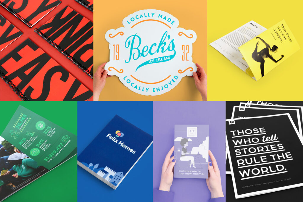
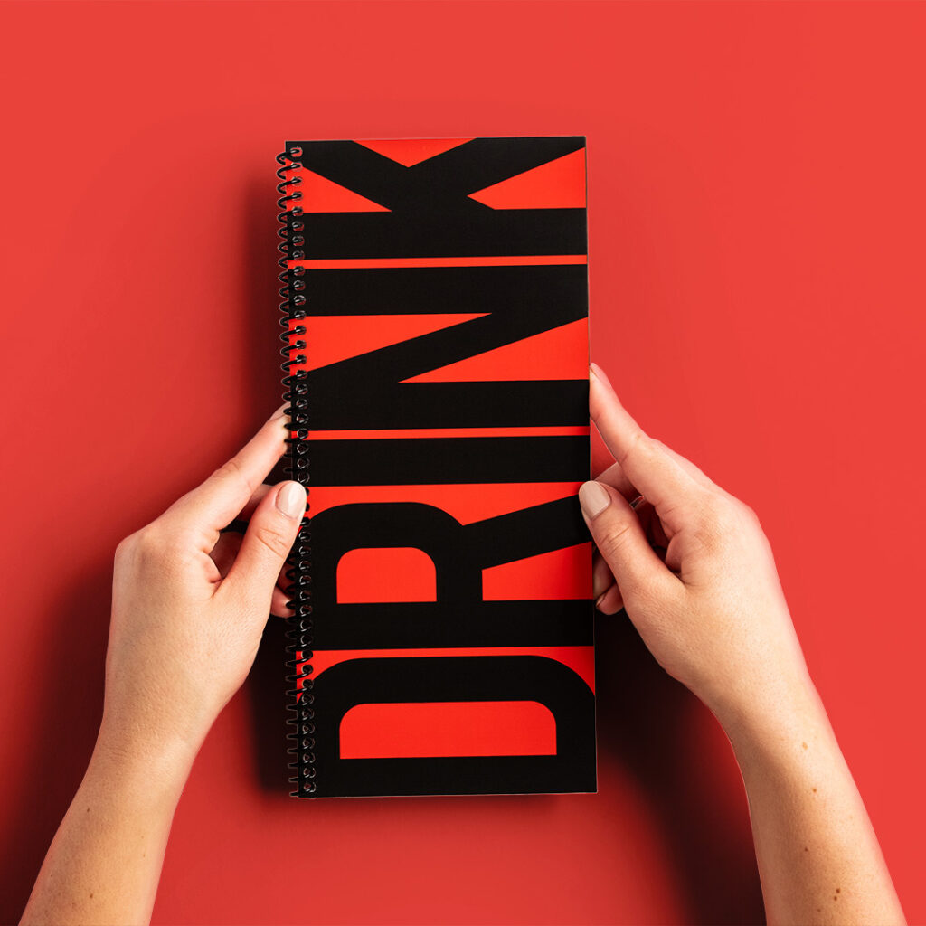
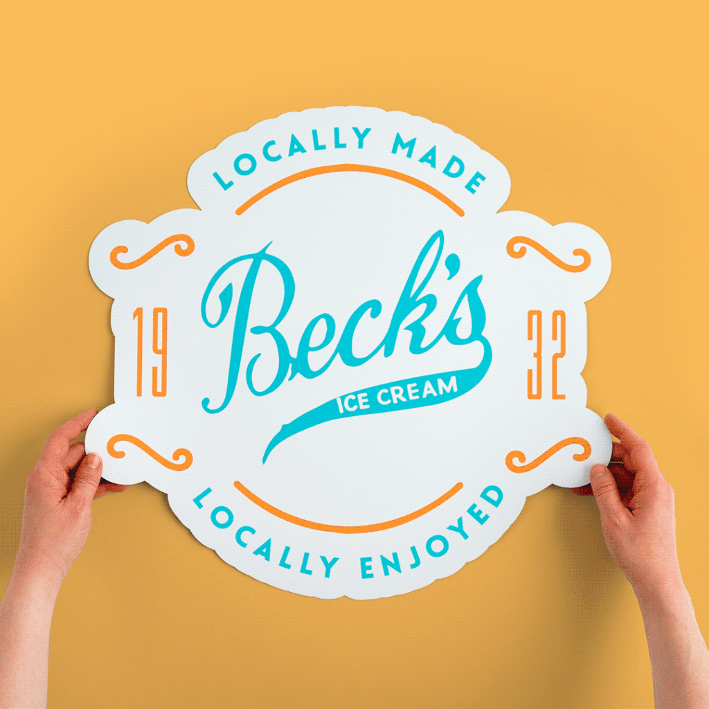
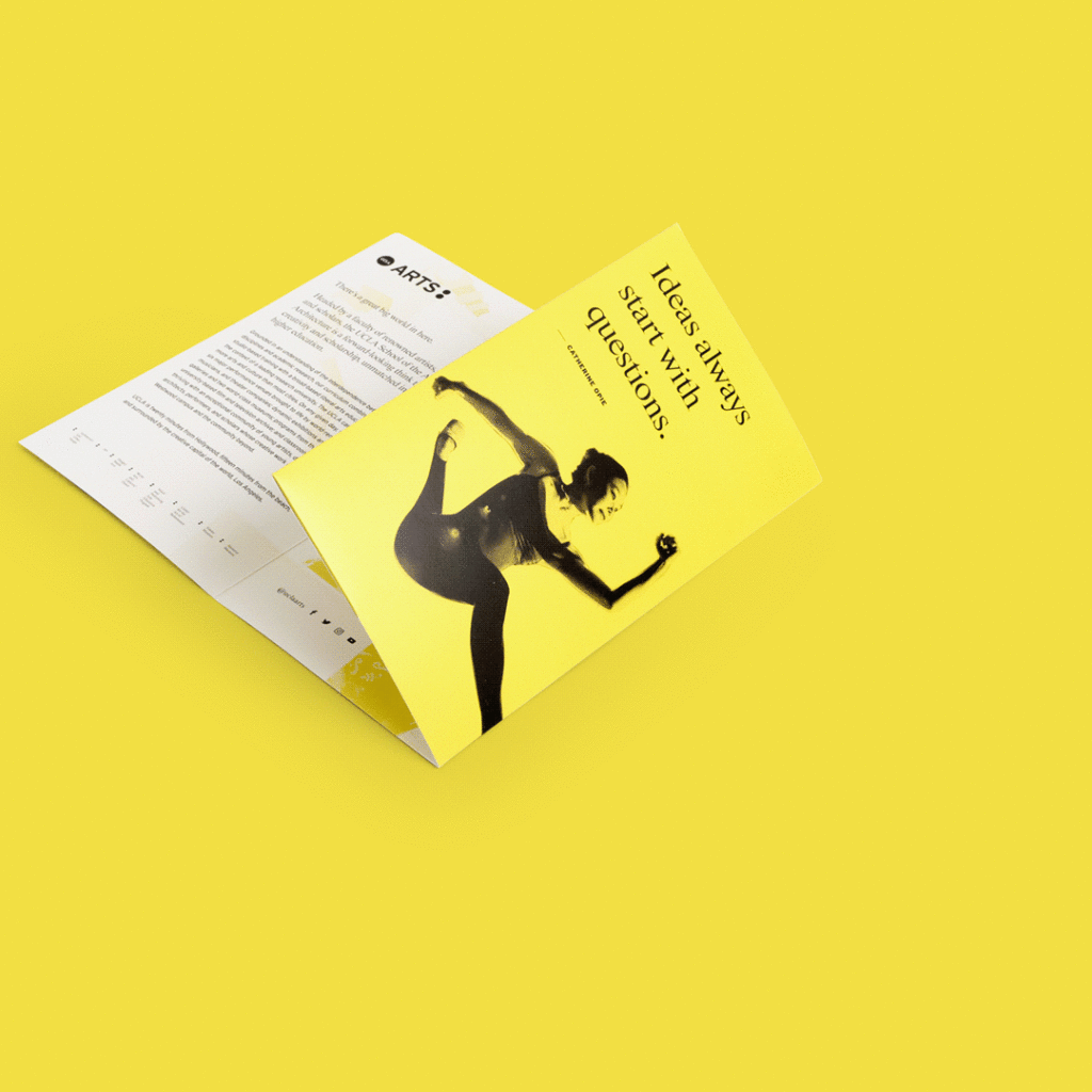
Featured Designs
Spiral Coil Booklet Design by Spiros Stogiannis Easy Pie
Die Cut Magnet Design by Malynda Resh
Tri-Fold Pocket Mailer Design by UCLA School of the Arts and Architecture
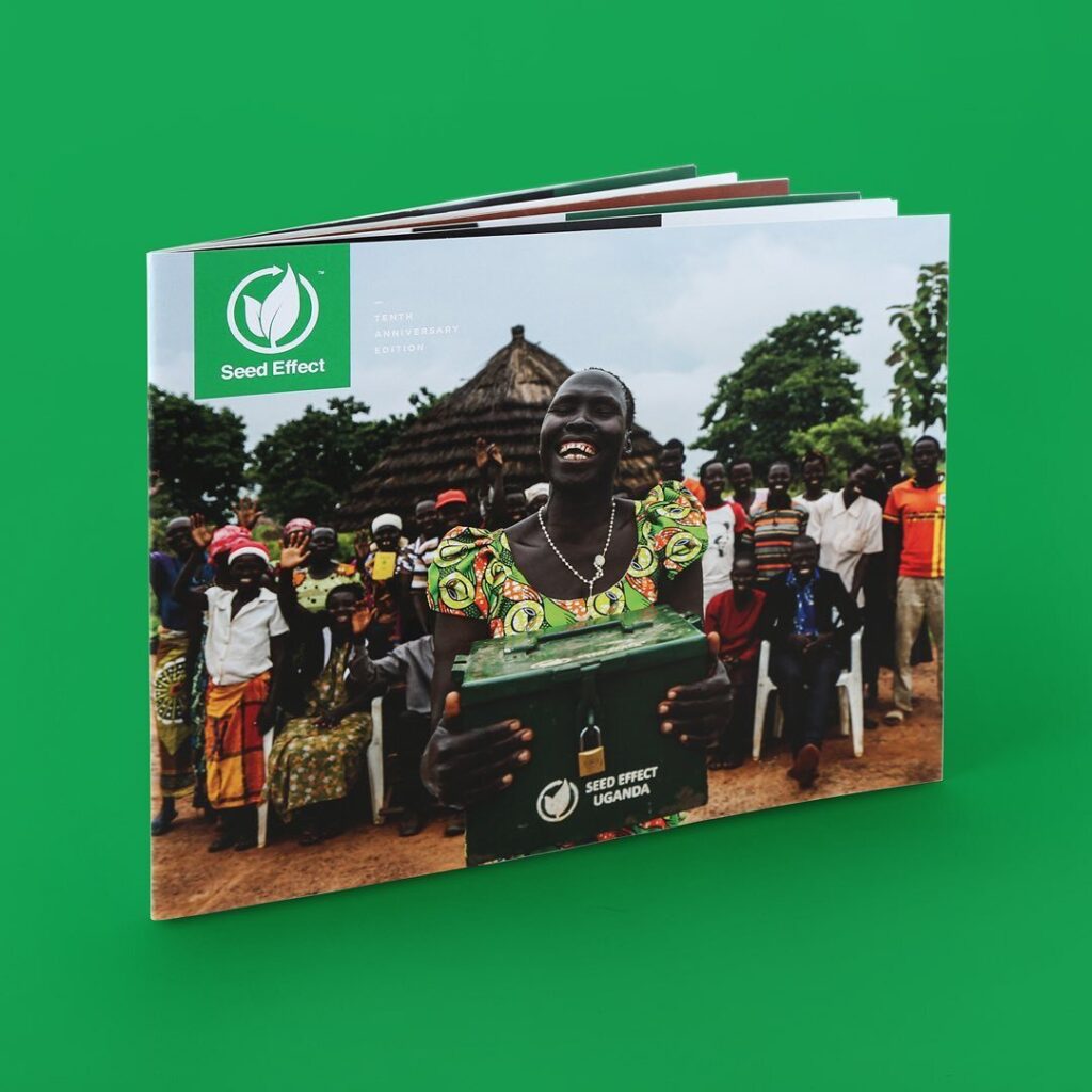
Saddle Stitch Design by Missy Williams, Seed Effect | Starla Koehler, Honeystreet
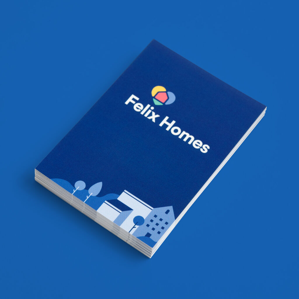
Business Card Design by Felixhomes.com
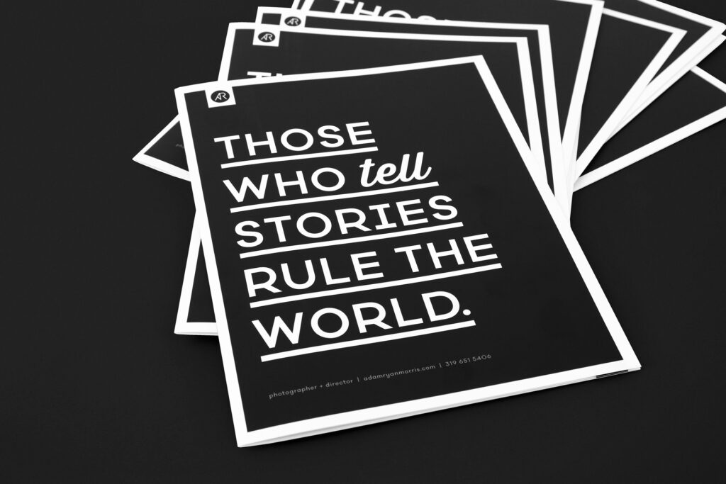
Saddle Stitch Booklet Photos by Adam Ryan Morris | Design by Jen Kuhn
Frequently Asked Questions
What are the principles of color psychology in retail display design?
Color psychology in retail shapes product perception, conveys brand identity, and influencers customer behavior. Color in display design affects the ways customers perceive a product.
How is color psychology used in visual merchandising of the store?
Color psychology influences visual merchandising by using different hues to evoke specific customer emotions and guide behavior.