Color Psychology: How to Use It for Marketing & Sales

The right color attracts the right customer. You know the one – the target customer, the repeat customer, the high-value customer. That’s why color psychology is crucial in print marketing. See how certain tints pair with certain tactics to create the reactions and results you want, plus get insider tips on how to use color effectively from The Bernard Group’s own creative director.

Seven print marketing pieces designed across the color spectrum in red, orange, yellow, green, blue, purple and black.

Set the Tone

When you think about it, colors do indeed elicit certain emotions, which lead to certain behaviors. It’s why we wear the clothes we wear, paint rooms to create the right vibe and, as it turns out, engage with certain products and companies.

In short, the importance of visuals in buying habits can’t be overlooked. So why would you overlook color in your print marketing? You wouldn’t, which is why you’re here. And why online printing with TBG takes your color strategy all the way over the rainbow to that pot of gold, aka your sales.

So where to begin with color marketing? The first step is deciding on what kind of response you’re trying to elicit.

  • If you want an awareness campaign to appeal to people’s emotions, you might choose a cool palette.
  • If you want a product campaign to result in sales, a warm palette creates an energetic spark.

Experiment with both and see which one makes the most sense. And if you’re still not sure, don’t worry. We’re about to break it down color by color with design tips from our very own creative director, Ferenc Andahazy.

Hint:

As a premium online printer, our print quality is second-to-none. Find all you need to know about color and ink here.

Two hands holding a drink menu with a red and black design and a spiral binding.

Red

Red stimulates our nervous system, which is why you have to be strategic about using it. A little can highlight a CTA (call to action) but a lot can feel like visual screaming.

General associations:

  • Intensity, strength, love, danger, action

Great for:

Andahazy’s advice:
“Red has to be the most powerful color, so proceed to use it with caution. But that’s also what makes it so appealing. It can be interpreted as anything from medical to passion, danger and more.”

Two hands holding a die-cut magnet printed with

Orange

Orange is an energetic color that embodies the intensity of red but with a friendliness that’s accessible. An effective accent color, orange grabs attention every time.

General associations:

  • Energy, boldness, upbeat, enthusiasm, courage

Great for:

Andahazy’s advice:
“Orange is really versatile and can be combined with many other colors and neutrals. Orange and gray combos always work nicely. And blue color schemes can use orange as an accent color. I always think of orange and blue as the best complementary color scheme.”

A tri-fold pocket mailer printed with a yellow and black design.

Yellow

With its optimism, yellow has a way of making people more receptive to what’s being communicated to them.

General associations:

  • Cheerfulness, accessibility, friendliness, optimism, affordability

Great for:

Andahazy’s advice:
“Instead of using a primary yellow, try using pastel tones or neon yellows to modernize your palette. Also, yellow tends to have low color contrast on white backgrounds, so steer away from choosing yellow for your text color in most situations.”

DYK:  Yellow is part of the CMYK color space. This color space also includes cyan, magenta and black and is used for printed materials.

A Seed Effect annual report booklet with a green design and a group of smiling people on the cover.

Green

Green creates positive feelings in customers because of its connection with nature and the environment. But go too dark and you’re slipping into jealous and greedy connotations, so choose your shades wisely.

General associations:

  • Nature, environmental responsibility, tranquility, growth, creativity, rebirth

Great for:

  • Carbon neutral businesses, door hangers for lawn care companies, mailers promoting products that help create a “new you” or provide a “fresh start”

Andahazy’s advice:
“With green, we think of anything from financial to environmentally conscious. Green can be a great option for brands focused on growth partnerships with their clients or selling a product with a sustainability aspect.”

A stack of real estate business cards with a blue design and

Blue

Everyone’s most preferred color, blue is the safest choice for any print marketing. If you want to create a sense of security with your target audience, go with blue.

General associations:

  • Competence, trustworthiness, inspiration, sincerity, integrity, dependability

Great for:

Andahazy’s advice:
“Blue is one of the most versatile colors. With its connotations, it can be a nice option for designs that aim to establish trust with customers.”

DYK:  Blue is part of the RGB color space. In this space, colors are created by mixing red, green and blue lights in various proportions. It’s best used for digital work displayed on any kind of screen.

A custom booklet printed with a light purple design and

Purple

Historically the symbol for royalty, purple still holds that reverent power today. With the ability to elicit feelings from playful to extravagant, purple is another color to be used tactically.

General associations:

  • Royalty, luxury, innovation, prestige, imagination, wisdom

Great for:

Andahazy’s advice:
“Purple is having a moment. Very Peri is the Pantone color of the year and is described as ‘a new Pantone color whose courageous presence encourages personal inventiveness and creativity.’ For new brands wanting to feel fresh or established brands wanting to reinvent themselves, desaturated purple tones can be a way to be seen as on-trend or trend-conscious.”

A stack of fanned-out custom booklets with a black and white design and

Black

Black makes a statement whether used all on its own or paired with another accent color. It’s the most versatile color in your print toolbox.

General associations:

  • Strength, sophistication, tradition, formality, mystery, elitism, authority

Great for:

Andahazy’s advice:
“Try combining blacks with neons for a vibrant and modern look. Avoid the strong color connotations associated with combining black with orange and yellow or your designs might instantly feel like Halloween or a construction site.”

“Colors can have huge emotional connotations, and therefore can directly impact our decisions.”

Q&A

Before you begin designing direct mail, custom signs, posters and more with our online printing services, get more pointers from Andahazy on color and all its chromatic complexity.

In what ways can color impact the success of print marketing and branding?

Ferenc Andahazy: “We fancy ourselves rational beings but people are actually emotional creatures. And in reality, our feelings heavily influence our decision-making. Colors can have huge emotional connotations, and therefore can directly impact our decisions.

“Since colors are naturally-occurring and ever-present, everybody already has a personal relationship with color that starts the moment we’re born. This relationship continues to evolve throughout our lives, as we constantly associate meaning with colors based on our environment, culture, what we eat, the products we use and so on.

“As designers, brands and marketers, being mindful of how our color choices might be widely perceived by our customers will help us infuse our brands with our desired intent and ultimately produce more successful campaigns.

“We can lean into strong color associations to use them to our advantage when appropriate and we can avoid them when they could risk convoluting our design intent, like a summer swimwear catalog decked out in red and green.”


When designing specific projects, how do you decide which colors to use?

Ferenc Andahazy: “For me, brand and subject matter are the two most important factors to consider when selecting colors.

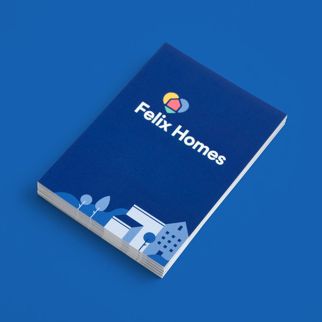
“If I’m working on a branding project, I’ll research common color themes within the brand’s industry. I’ll also look for color cues in the brand’s products and the unique traits they need to express. Maybe the product has an inherent color or the brand wants to be viewed as energetic. All of this information helps hone in on a good color direction. When the brand guidelines are defined, every new color I choose needs to not conflict with the primary colorways.

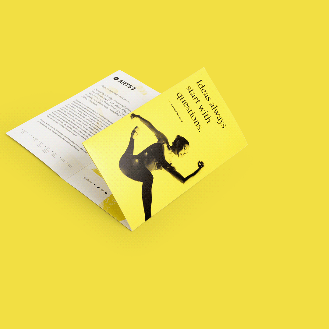
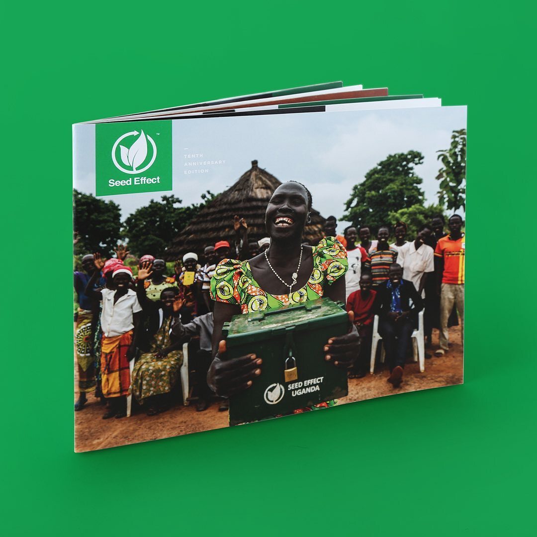
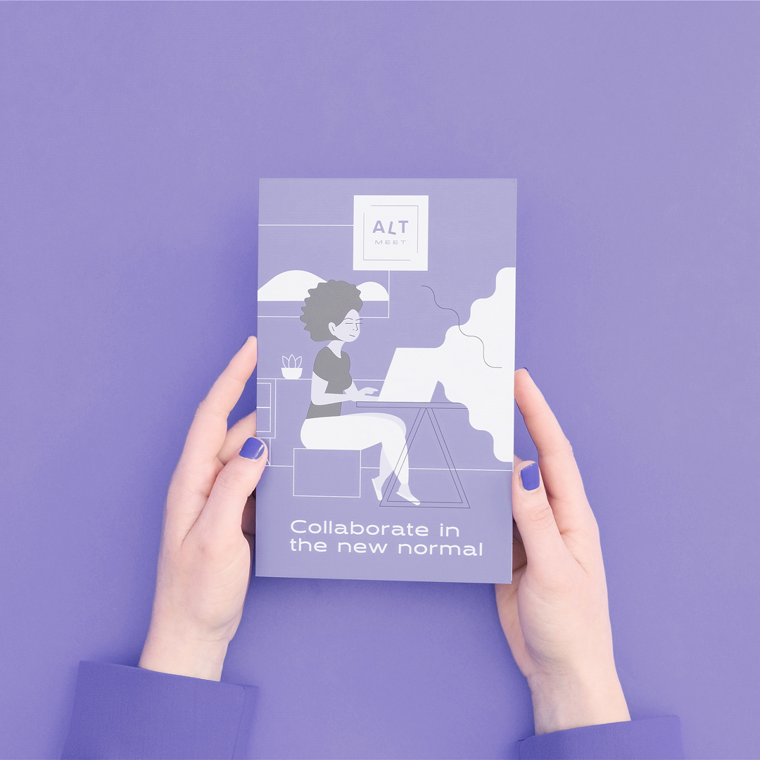
“Next, I’ll consider the subject matter. Maybe I’m designing a mailer for a specific product campaign or seasonal promotion, or a booklet about a brand’s sustainability practices. Each type of content might have implied color associations I should consider or leverage.

“When I know exactly what I’m designing and how I want it to be perceived, I’ll start looking for inspiration. I’m a Pinterest-er, so I create new inspiration boards for each of my projects and share those with the rest of my team. We’ll look for photos, patterns and other design work that evokes the feelings we want to convey. Once we have a full board, it’s usually easy to spot color themes that are repeated across our collection.”

“Negative space and white space will always be one of the most powerful tools in a designer’s arsenal.”

Should designers stick with one color or are particular color combinations effective, too?

Ferenc Andahazy: “Color is subjective, and like much of design, there are no absolutes. For me, I often choose one prominent color and one accent color, but it really depends on the project. As designers, we should understand some basics about color theory. Knowledge about primary colors, complementary colors, shades and tints can all help make color selection easier.

“In general, trust your eye and your instincts about color. Most importantly, just spend some time thinking about it!”


Any other tips and tricks for designing with color?

Ferenc Andahazy: “Don’t forget about white! Negative space and white space will always be one of the most powerful tools in a designer’s arsenal. After all, the absence of color is the perfect opposite of color. Negative space creates visual balance and necessary contrast to color.

“If design was music, negative space would be like the silence between the notes. It’s the silence between the notes that makes the music interesting. In design, negative space makes the use of color more interesting. This incorporation of restraint and minimalism easily and instantly makes a design more elegant and impactful.

“This is probably one of my most heavily used design techniques. For example, if you’re designing a book with a colorful cover, have the first spread be mostly white. If you are designing a brochureenvelope or packaging with a white exterior, have the interior reveal a pop of color.

“Creating unexpected, contrasting design moments between color and white space makes for a more engaging and interesting design. Keep your viewers guessing. Don’t be a one-note designer!”

Hint:

‘Want even more design tips? As your full-service online printing shop, we’ve got you covered: Graphic Design Tips for Beginners